
The aim of this page is to highlight the different types of free visualization tools that can be used to understand large and small datasets in forms of charts and graphs. Every program listed below requires no prior technical know-how and at most entails only some practice before being able to skillfully wield each programs’ specific intricacies. Becoming familiar with many of these visualization tools will allow you to not only better understand and picture your data sets, but will also help you recognize patterns in your data that would otherwise be hidden.
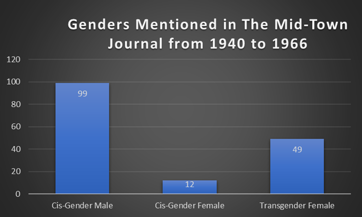
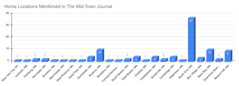
The data set used in the digital humanities project Love Cults, Masquerading Gals, and Subway Sammies: A Digital Visualization and Analysis of the LGBTQ+ Subcultures of Mid-Twentieth Century Boston serves as the foundation of the graphs and charts throughout this page. The data from the project originates from a local Boston newspaper called The Mid-Town Journal in which information like addresses, genders, and sexual orientations have been quantified. Corresponding short summaries and reviews have been written to detail the benefits and drawbacks of each individual visualization tool.
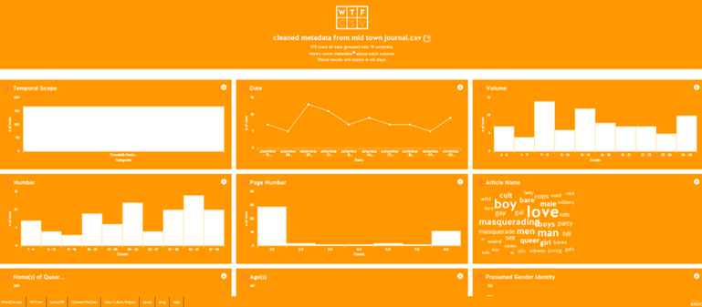
DataBasic is a good starting point in beginning to understand your data set regardless of any proficiency. DataBasic offers four specific visualization tools ranging from WordCounter that analyzes your text to ConnectTheDots that charts out the networks and relationships within the data. Though their tool, WTFcsv is a great place to upload your completed csv file and to see what your data is revealing.
Pros:
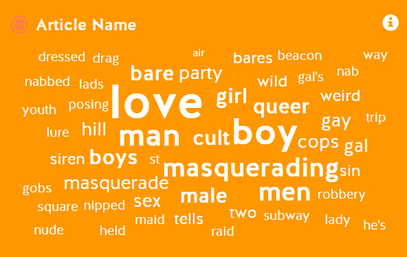
WTFcsv is easy to use and requires only a completed csv converted data set. This tool analyzes each column in your data, graphs it, and provides the smallest and largest numbers present, the total, the averages, the median and standard deviations. WTFcsv also generates a word cloud if a column is full of text. The graphs produced are interactive and engaging. After creating your visualization, it can be easily shared via an URL.
Cons:
Some of the columns that WTFcsv analyzes can result in nonsensical or irrelevant conclusions. Besides sharing the URL of your findings, the greatest drawback is how limited you are in disseminating your data publicly. DataBasics does not allow the export of any of the graphs and if you wanted to simply share your results, taking a screenshot of a particular module is the most effective means.

RAWGraphs is another open source data visualization tool geared towards those who already have some previous experience with visualization programs. RAWGraphs is more of an user intense program, but its multitude of chart options can produce informative visualizations for those who learn its complexities. Fortunately, the creators have provided free tutorials and workshops for beginners.
Pros:
One of the most attractive features of RAWGraphs is the myriad of chart options available. There are currently 31 different charts that can highlight elements such as correlations, proportions, networks, distributions, and hierarchies. Using a data set with three to four columns is ideal in producing the most revealing results. Once your chart is generated, there are numerous customization options. You can adjust the width, height, margins, and color schemes. RAWGraphs also provides a few export options. You can export your graphs as static SVG, PNG, or a JPG images.
Cons:
The learning curve is relatively steep and it can be difficult in placing the correct dimensions of your data into the proper chart variables so that the program can create a comprehensible graph. The variety of charts available can overwhelm an user and deciding which chart best fits your data is time consuming.

Datawrapper is a free visualization program where you can generate charts, graphs, tables and maps. It is one of the most user friendly and accessible data visualization tools publicly available.
Pros:
Datawrapper offers an easy step-by-step process of uploading a variety of data sets. Besides the standard csv file, the site allows for the upload of google sheets, an external data set, or the copying and pasting a data table. Datawrapper guides the user through the process of uploading your data, checking if it is comprehensible, automatically generating the data as 20 possible chart types and finally publishing the desired chart. The options provided make it easy to fully annotate your chart with a title, description and notes. Your chart can then be exported as a PNG image or as a link to share. Datawrapper also provides code to embed the graph into any personal website with the added benefit of it being fully interactive for users.
Cons:
The drawbacks of Datawrapper mostly stem from its wealth of options that it provides for the user which can have the unintended effect of generating a cluttered chart. Embedding the code from the host site onto a personal or institutional website means that the graph lives on the Datawrapper servers which means that the interactivity of the graph can malfunction depending on the compatibility of future software updates. It is advisable to screen shot any charts produced as a means to hedge against future hosting issues.
Flourish is an easy to use data visualization and storytelling software program very similar to Datawrapper. It is free for all users.
Pros:
Flourish is an incredibly user friendly data visualization tool that is easy to learn and master for all users. One of the great benefits of Flourish are the multitude of different graphs available. For instance, simply graphs like bar charts, pie charts and line charts can all be easily created. A user can also utilize projection maps in which data can be transposed onto a wide variety of maps. More advanced users can also use charts that show change overtime that are called bar chart races. Scatter plots, heat maps and hierarchy graphs are also available.
Cons:
The only noticeable drawbacks of Flourish are the slight learning curve needed to master many of their graphs and the know-how of properly formatting your data within a Microsoft Excel sheet so that it can be successfully uploaded and transformed into one of their graphs. Another issue is that because they offer so many different maps, one might be overwhelmed with what graph to use.
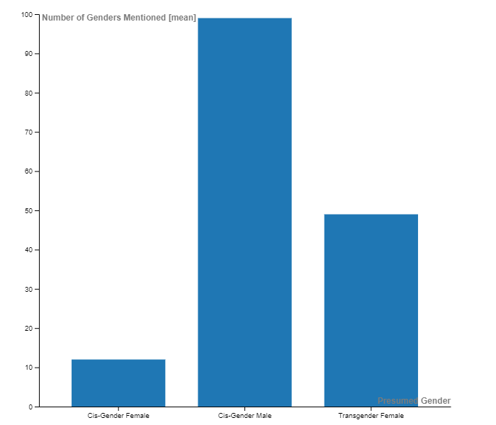
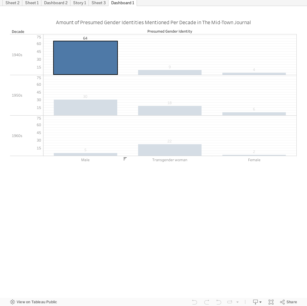
When compared to Datawrapper, Tableau Public is a more user intense data visualization tool. But, spending some time watching the website’s video tutorials and practicing with its interface, the graphs and charts that it can produce are greatly informative and professional looking.
Pros:
Tableau Public has the tools to create detailed and comprehensive charts that can be exported as images, raw data, PDF, PowerPoint, crosstab or be shared and viewed through Tableau Public. After completing a chart, the site also provides code for embedding into personal or institutional websites. Like Datawrapper, each graph can be interactive and offers a large variety of customization options concerning colors and styles.
Cons:
Tableau Public is the free version of Tableau Desktop which means it lacks some of the more intricate features of its paid counterpart. For Boston College students, institutional licenses are available for the paid version. The user interface can be overwhelming for a novice user and takes time to master.
Excel will be one of the most familiar programs available because it is part of the Microsoft Suite. Besides using its spreadsheet function, its ability to generate charts are useful. Overall, it is a straightforward and relatively simple to use program that has the ability to produce a variety of complex charts and graphs.
Pros:
Excel offers a recommended charts option in which it will automatically generate several possible charts that it thinks best displays the data. The customization options are expansive. The range of styles and colors available are generous. Due to Excel’s popularity, there is a broad array of online tutorials that can provide further expertise.
Cons:
Excel is frequently error prone depending on how complex and comprehensible your data is. It also lacks the intricate options found within Tableau Public, DataWrapper or RAWGraphs. Some of the editing and chart design options are buried within subfolders which can make it frustrating to use. Any charts produced can only be shared as static images.
Google Sheets is a spreadsheet program that is available to use regardless of having a PC or a Mac. With Excel being so similar to using Google Sheets, it means that having familiarity with one program helps understanding how to use the other. Simply creating a Google account is all that it takes to begin using Google Sheets.
Pros:
Google Sheets will automatically generate a suggested chart with your data. There are a large amount of customization options offered for the charts. These options can be easily accessed under its chart editor. Besides copying and pasting a graph as an image, Google allows you to easily share your data and charts via a publicly available link.
Cons:
Like Excel, Google Sheets lacks the wide ranging customization and chart options found in Tableau Public. The interactivity of its graphs are limited to static images.